ImageGalleryComponent
An Image Gallery component is used for adding a number of images to your site, in a variety of ways.
Where to Find
This Component can be found in the "Add Block to Page" section of the Toolbar.
Adding to Website
After selecting this Component, you will be able to choose exactly where you want to add it!
You will see all available content locations it can be added to - on the current page only (content locations in Gold), on every page (content locations in Red), or on every page under the current page directory (content locations in Blue. For example - if you are editing a page called "About", the blue content locations would allow you to add this component to all pages under the /about/ directory).
Options
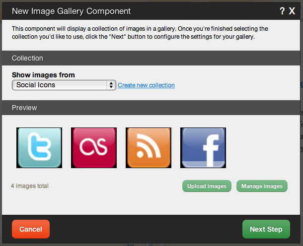
After choosing where this Component will appear, you can configure it by choosing the folder to show images from. You can also create a new folder.
Clicking on the "click here" or "Upload images" link in the Preview area will take you to the File Manager which you can use to upload images from your computer.
Clicking on "Manage images" will take you to the main file manager area with the "Images" filter in place to only show uploaded images.
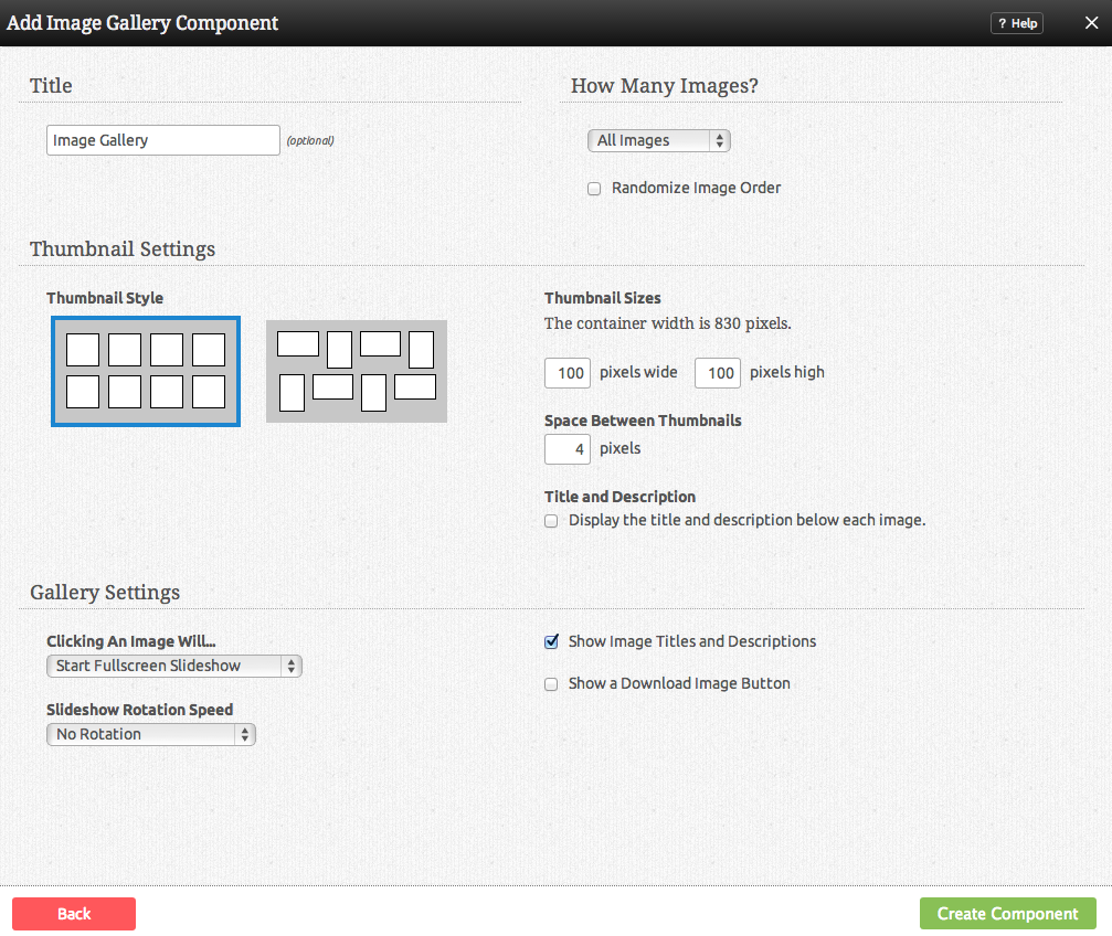
Further configuration can be done before the Component is added.
You can optionally set a Title to be displayed above the Image Gallery content on your page.
The Image Selection option allows you to choose how the images in this component display on your site. You can choose to show all, or show a number that you define. You can also choose to Randomize the displayed images in either case, making them display in random order each time the page is viewed.
The Number of Images that display at once can be set to show all, or show only a number of the most recent images.
Clicking Show All as Carousel option allows you to view your images in a click-through carousel. If this is chosen, you can configure Title settings and manage Auto rotate delay settings. If you enter a number in this box, your image gallery will automatically rotate between the selected images. The image will be shown for the number of seconds specified.
Fade duration is the amount of time in milliseconds that it takes to transition from one image to another. 1000 milliseconds is 1 second.
The Click Behaviour option will allow you to set what happens when an image in the gallery is clicked on. The choices are:
- Open Lightbox (opens the image clicked in a lightbox - if more than one image exists, this uses gallery mode, which opens the image clicked in a lightbox, and allows you to move your cursor over the image to go to the next or previous in the collection)
- Link to image (Links directly to the image file)
- No click action (clicking on the image will do nothing)
There are several different Themes you can choose from for your image gallery. For example, Dark Rounded will border your images with a rounded black border.
- Tip: Don't want borders around your images at all? Add this line of code to your theme's CSS file while editing your theme's source code to remove them:
.image_gallery_component .image img { border-width: 0px; }
You can optionally set a Slideshow Delay. If you enter a number in this box, your lightbox will open in slideshow mode, showing each image for this many seconds before advancing to the next one.
The Image Size can be set to one of a variety of combinations of cropped and non-cropped.
Editing
Need to make a change? You can access the settings for this Component again by clicking on the "Settings" button on the Component Toolbar.
Example Sites
An example of this Component can be viewed on the Multimedia page of http://builderexample.com


