Content Locations
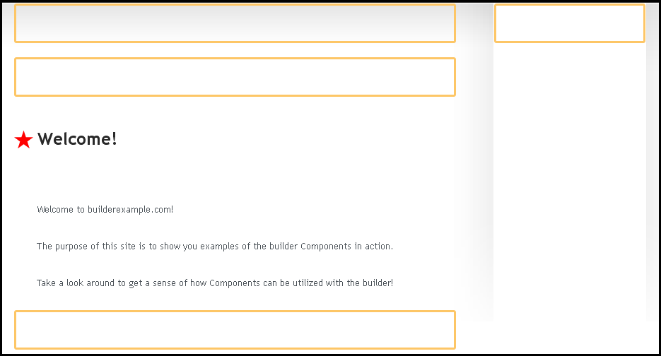
Content Locations are areas within your page, pages, or directory folders where a Component can be added. These can be seen in the process of adding a Component to a page, or moving a component.
Note: Pressing the "escape" key on your keyboard at these stages will cancel this and not apply or move the Component.
Content locations as they display while editing a website
Content Location Code:
Content locations are div elements specified as areas for site content where you can drag and drop content components using the Component Toolbar. The only required content location is #location_0, but you can have as many locations as you want in your theme. In most themes there are only 2 or 3 locations, used for columns on the site layout.
Example of content locations html
<div id="location_0" class="location">
  Content components can be placed here using the toolbar
</div>

<div id="location_1" class="location">
  Content components can be placed here using the toolbar
</div>
Location 0 is required, but there is no limit to how many content locations you can create.
Since Viviti is a content management system, you create all content using the Viviti editor toolbar after logging in. You will be able to place Optional Content Components into any content location in your theme. Content locations can be surrounded by as much html as you like. Viviti will only manage content within the specified content locations.
Modifying content locations html
The content locations html code can be modified to disable the ability to add or remove components from within it by changing the code within the class area, per the below example:
<div id="location_0" class="location readonly">
  Content components can't be placed here using the toolbar
</div>
A visual confirmation of this setting change will be the removal of the broken line border that surrounds the content location. Additionally, the "Add it Here" button will not appear within this content location.
With this setting change, you will be able to use many of the features of the Component Toolbar, such as editing and changing settings. You will not be able to delete the component.
This is useful if you want to have a content location that is for a very specific component, and don't want it to show up as a place to add additional components.
Note: Using the Collapsing Components on the Status Bar will allow the default functioning of a modified content location, including adding or deleting components.

