HeadingComponent
Insert a highly customizable text header into your content with this component, with support for custom backgrounds, sizing, and CSS.
Where to Find
This Component can be found in the "Add Content to Page" section of the Toolbar.
Adding to Website
After selecting this Component, you will be able to choose exactly where you want to add it!
You will see all available content locations it can be added to - on the current page only (content locations in Gold), on every page (content locations in Red), or on every page under the current page directory (content locations in Blue. For example - if you are editing a page called "About", the blue content locations would allow you to add this component to all pages under the /about/ directory).
Options

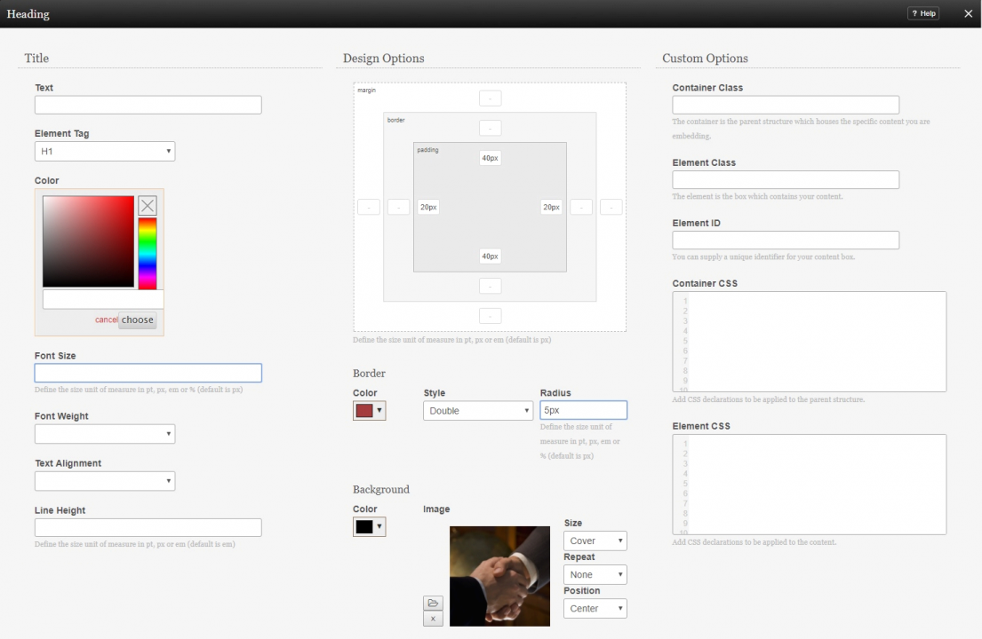
After choosing where this Component will appear, the Title text can be configured, along with extra design options for optional custom backgrounds or borders.
You can optionally change the color of the text with the included color selector, while the Element Tag can select a range of predefined styles for the font, size, and spacing.
The font size can be adjusted here, as well as the font weight and alignment in the header. Additionally, the line height can be adjusted, such as for cases where the title is long enough to wrap.
Under Design Options, an optional custom background for the text can be uploaded and added, as well as changing the size and dimensions of the header box itself to accommodate the image, such as allowing extra height above and/or below the text to allow more of the image to show.
Borders for the header box can also be customized here, such as changing the style and radius of rounded corners if desired.
The last section, Custom Options, is to allow experienced designers to easily create and apply their own additional CSS for extra flexibility.
Editing
Need to make a change? You can access the settings for this Component again by clicking on the "Settings" button on the Component Toolbar.
