TextorContentBlockComponent: Difference between revisions
mNo edit summary |
mNo edit summary |
||
| Line 15: | Line 15: | ||
After selecting this Component, you will be able to choose exactly where you want to add it! | After selecting this Component, you will be able to choose exactly where you want to add it! | ||
You will see all available locations it can added - on the current page only (content locations in Red) or on every page (content locations in Gold). | You will see all available [[content locations]] it can be added - on the current page only (content locations in Red) or on every page (content locations in Gold). | ||
Revision as of 00:45, 9 December 2008
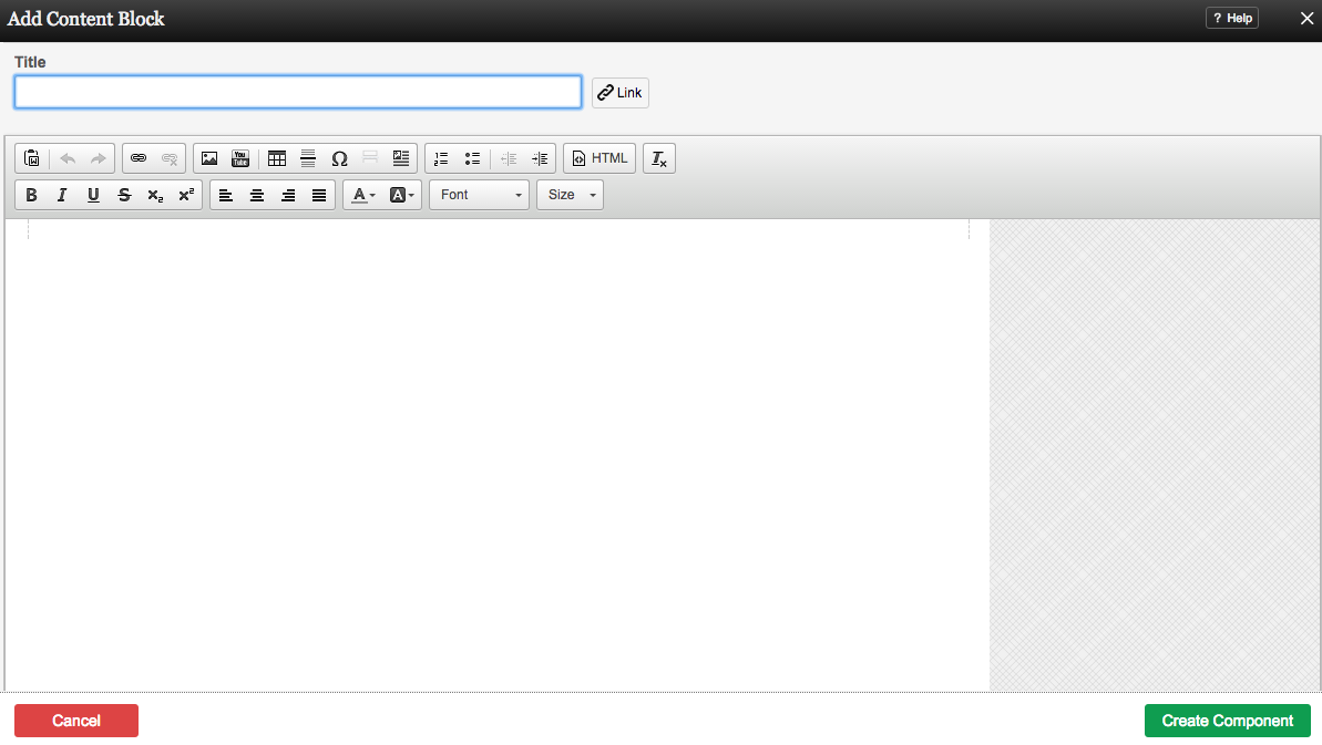
A custom component is used for text and/or images. It is for creating generic content blocks where you can place whatever content you wish.
Where to Find:
This Component can be found in the "Add to Page..." section of the Toolbar.
Adding to Website:
After selecting this Component, you will be able to choose exactly where you want to add it!
You will see all available content locations it can be added - on the current page only (content locations in Red) or on every page (content locations in Gold).
Configuring:
You can optionally set a Title to be displayed above the content on your page.
You can use Content Templates to insert a premade content block. The available Content Templates are:
Text with right aligned image - A basic column of text next to an image. Useful for about us, bios, portfolio item and other pages where the image relates closely to the text.
Text with left aligned image - A basic column of text next to an image. Useful for about us, bios, portfolio item and other pages where the image relates closely to the text.
Two small images with text - Great for about us pages, partnership descriptions and other pages where the images are there for reference.
Two columns with text - Your standard two column layout. The infinite possibilities include stories, histories, about us and other pages with a lot of text.
Two columns with images on top - This is great for describing two images on a single page, or comparing two things side by side.
Three columns with text - A three column layout. Excellent for smaller text pages and ideal for lists of items or links.
Three columns with images on top - This is good for comparing or writing about multiple images, or for introducing multiple members of a team and other similar pages.
Editing:
Need to make a change? You can access the settings for this Component again by clicking on the "Settings" button on the content toolbar.
Example:
An example of this Component can be viewed on the Web Tools page of http://example.viviti.com

