Creating your first Website Builder site: Difference between revisions
No edit summary |
|||
(No difference)
| |||
Revision as of 11:02, 15 November 2010
This page will take you through the process of creating your first Web-Builder site from the beginning, assuming you haven't already built a page.
The purpose of this section is to break down the process step by step for those of you who would like help at each stage.
Some information from other pages may be duplicated here, but the other pages will contain additional information not found here, and this page will serve as a simple one stop location for all of the steps involved in creating your first builder site.
Let's begin!
1. Choosing your Theme
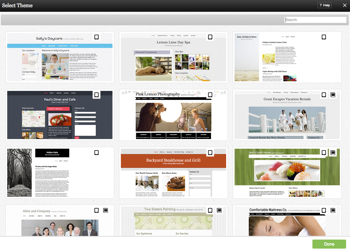
Immediately after completing registration, you will be given the ability to select your Theme.
All available Themes can be viewed here. You can sort by popularity, date added or filter by key word or description. Suggested filters are listed along the left column, however we invite you to filter by a word or description of your choice as well. Clicking in "View all themes" will reset the filter and bring you back to the main page. Icons representing Available layouts are also displayed here to give you a quick look at how each theme can be configured.
The filter is smart in that it will give you keyword suggestions as you type. Try it out!
Note: Clicking on a Theme thumbnail will not immediately apply it. You will be able to take a closer look before choosing it by clicking on "Use this Theme".
Simply click on the Theme you would like to use and click the "Use this Theme" button. Choosing a New Theme later is quick and easy, so don't worry about making a permanent choice here.
2. The Website Editor
You should now be viewing a nice looking page to be customized to your specifications. That was easy!
The area you are now viewing is the website editor. We encourage you to explore this area to see what is possible. The website editor areas will be identified and more information can be found on their respective pages.
Here is a breakdown of the website editor:
Utility Bars:
These bars can be used to perform almost every task available with Web-Builder, so it is a good idea to become familiar with them.
1. Toolbar
2. Status Bar
Page Elements:
The elements that make up your website. Please note that these can be edited but not removed.
3. Primary Navigation - this group of links is conveniently located on your page to link visitors to any of your other pages. Pages that are unpublished will not appear here.
For further information, please see Managing Primary Navigation.
4. Site Heading - The title of the current page. This will also display in your browsers title bar.
A Site Sub-Heading element is also available below the heading, however it is empty by default.
5. Theme Image - Your main page image. This is set as the default image of the chosen Theme, however this can easily be changed. You can also add additional images.
9. Copyright - The copyright information for your website. You can modify this to include additional text.
Default Components:
These Components are added here by default as a quick way to get started with some common and popular components, however these can easily be changed or removed via the Component Editor toolbar. If you would like to use any of them, the default text included within them will help you get started.
6. Blog Posts
3. Editing a Page
Now that you have become familiar with what makes up a Web-Builder page and what tools are available to you, we can now modify it to suit our needs. Here we will go through some common tasks a typical member would do to personalize their website.
We will assume that you want to keep all of the default Components for the remaining tutorial.
Modifying a Component:
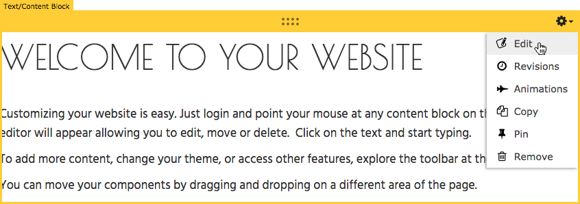
Our first task will be to modify one of the default Components to add a personal touch to the website. In this example, it will be the Text or Content Block Component. Simply move your cursor over the component to access the Component Toolbar and click the "Edit" icon.
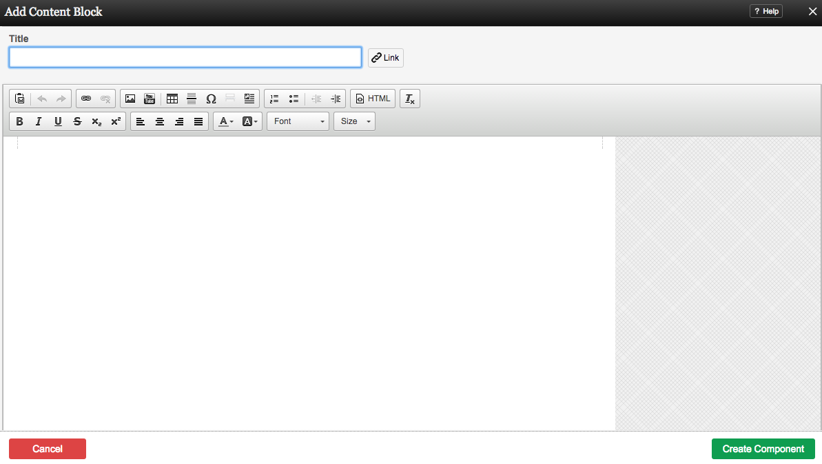
This will bring you to the Content Block editor.
Simply change the default text to a personalized message and click the "Save" button when finished.
More Content Blocks can be added, so don't worry about writing all of the text you want on this page in this box!
Adding a Component
Let's suppose you want to add an image to this page. Simply click Add To Page on the Toolbar and locate the Component.
You will see all available content locations it can be added - on the current page only (content locations in Gold), on every page (content locations in Red), or on every page under the current page directory (content locations in Blue. For example - if you are editing a page called "About", the blue content locations would allow you to add this component to all pages under the /about/ directory).
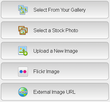
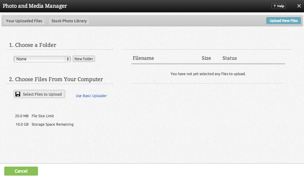
Because this is a new account and we haven't uploaded any images, we will need to do this first using the File Manager. Click on the "upload a new file" link to access it.
We will assume you want to upload an image you have on your computer and are not wanting to use an external image or an image located in your Flickr account.
Clicking the "Add Files" button will allow you to browse files you have locally on your computer to be uploaded. Once you have located your image file, click on "Upload" at the bottom of the page to complete the process.
You will return to the main first area with your uploaded image chosen as your image selection.
After you click on "Insert", the image will be embedded into a Text or Content Block for further customization before it is added to your page.
Our website with a customized Content Block and inserted image.
3. Creating a New Page
As you have seen, Web-Builder creates a few extra pages for you initially with some common purposes, but these aren't required and you can create additional pages for other purposes, such as an order form, or a page for a specific component or components.
In this section, we will create a new page per the above example - an order form for a small business.
As before, simply click Add To Page on the Toolbar and locate the Component.
After selecting this Component, you will be able to choose exactly where you want to add it as we did with the single image previously.

